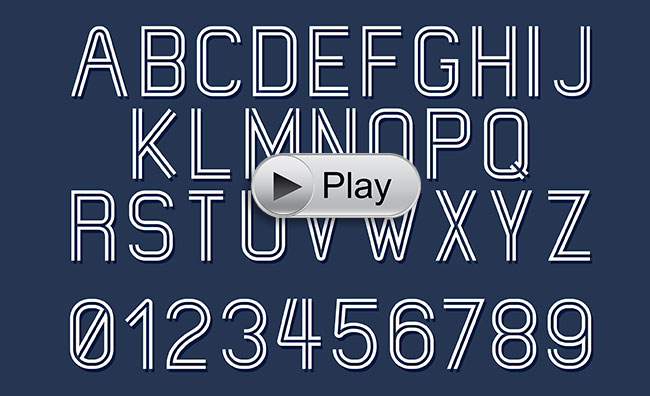
How to choose the right fonts for your website
By The BWC Team

It was not that many years ago when a website owner was given the choice of five font types for his website. The same was true for printing until digital offset printing came to life. Nowadays the choice for font types is close to limitless but this does not mean you should use any fonts on your site without thinking first if this is the right font for you.
First and foremost, there are different ways to use special fonts on your site. You can encrypt a “non-standard” font onto your site (by uploading font files on your server) or use Google Font Library. The Google Font Library is by far the best, easiest and most secured way to use a special font on a website. They offer an easy way for you to preview you text in different fonts.
Typography (the art of font type to make a written language readable and appealing) is important on a website but often disregarded. Also note that choosing the right font for a website may be different from printed material like brochures, billboards or TV adds. On a website you have to make sure your selected font:
- Is easily readable at-a-glance … Most website visitors have a short attention spam so it is important that the text is easy and quick to read. A complicated and ornate font would not work for a fast read; instead use a “sans serif” font for most of the textual content.
- Reads well on the background of the page … If you have a color or textured background, you would need to make sure that font reads well on it.
- Has the right size for desktop, smartphones and tablets versions … You can code your text to display at a different font size based on the mobile device used by your visitors. Test your text on popular smartphones and tablets, not just on the desktop of your computer.
- Has the right thickness … To put emphasis on a word, making it bold often works. You can often assign the exact thickness you want the text to display with.
- Has the right letter spacing … If you chose a “tight” font, you might want to consider giving it some slight spacing between the letter. This is easily done with code and is called “letter-spacing”.
- Has the right styling to complement your brand … Italic style should not be overused but can be as useful as bold. Underline should be used for links in most cases since this is what Internet users are used to.
- Supports the message behind the textual content … Depending if you want to be serious, professional, kind or playful, you would use a different font.
- Speaks to your target audience’s style … Again your clients have a certain style and expectation. If you target top level executives, you would want to consider a higher-end, modern yet elegant font.
- Works well for your industry … Each industry have a common look and feel. Selling online gaming services is very different from being a family therapist. Make sure your selected font works well with what your company does.
- Is different based on the purpose of the text … Typically call-to-actions should be different from the main textual content of each page. Saying this we recommend to use a maximum of two font families on a website, one more standard for content, a second one stronger to encourage a call-to-action.
Remember your brand and use fonts that are part of your brand so that you portrait a uniform image online to your clients, vendors and prospects.

Questions about this subject?
Never hesitate to contact our friendly team by phone at (707) 794-9999 (Pacific Standard Time) or by email here. Have a successful day!